METALLICA Looks Outside The Music Industry For Design And Branding
September 13, 2008METALLICA worked with design company Turner Duckworth to create packaging and branding for its new album, "Death Magnetic". Turner Duckworth is better known for designing logos, packaging and visual identity systems for consumer brands like Coca-Cola and Amazon.com than for working with rock bands.
With the music industry in a state of rapid change, the band was looking for new ideas. "This time, we wanted to work with professionals who understand iconography," said James Hetfield, METALLICA's lead singer. Lars Ulrich, the band's drummer and frequent spokesperson added, "We wanted somebody who commanded respect in branding but were not jaded by the music business. Someone who would bring fresh ideas. Enter Turner Duckworth. Enter happy days."
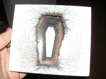
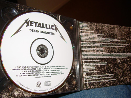
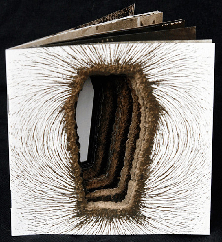
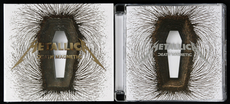
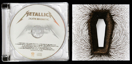
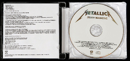
With the growth of downloading, METALLICA was looking for a package that would rekindle interest in CDs. But with the consolidation of music sales in the U.S. into a few national retailers (Wal-Mart, Target, Best Buy),the package had to conform to highly limiting standards. Turner Duckworth's answer was to create an iconic, three dimensional package using a powerful image and an ingenious layered die cut. As Lars Ulrich put it, "We got ourselves a very unique package."
David Turner, partner, Turner Duckworth, said, "The songs are about how death — and life — repels and attracts us. Our image expresses the theme, with a white coffin resting in a grave, surrounded by a magnetic field. But it's also open to other interpretations, which keeps it interesting after multiple viewings. This image really puts the graphic in graphic design." The image was created to be recognizable even on a cell phone screen. "It's not just about sleeve art any more; it's about creating icons that work across media," added Turner. That's a discipline Turner Duckworth understands well; recent work for the Coca-Cola brand has won a slew of international design awards including the Grand Prix at the Cannes Lions.
Turner Duckworth re-worked the classic METALLICA logo, created a signature typographic style and designed key promotional materials including a flag, a coffin shaped special edition and a vinyl boxed set. A design kit including logos, imagery and graphics was distributed to the band's record companies to produce a vast array of promotional materials around the world.
Designers in both London and San Francisco collaborated on the designs. "Everyone got fired up working on this project. METALLICA instinctively understand branding and really appreciate the value we created for them. There was no rock star attitude, just enthusiasm and creativity," said Bruce Duckworth, partner, Turner Duckworth.
Photos by Greg Mason:
